Search & Filter supports integration with themes by allowing them define a set of styles to use.
This allows theme builders to provide a seamless integration of their theme styling with Search & Filter.
How it works
If a theme opts in to supporting Search & Filter styles then a “Theme” styles preset will be created – this preset cannot be edited or deleted and always appears at the top of the styles presets lists.
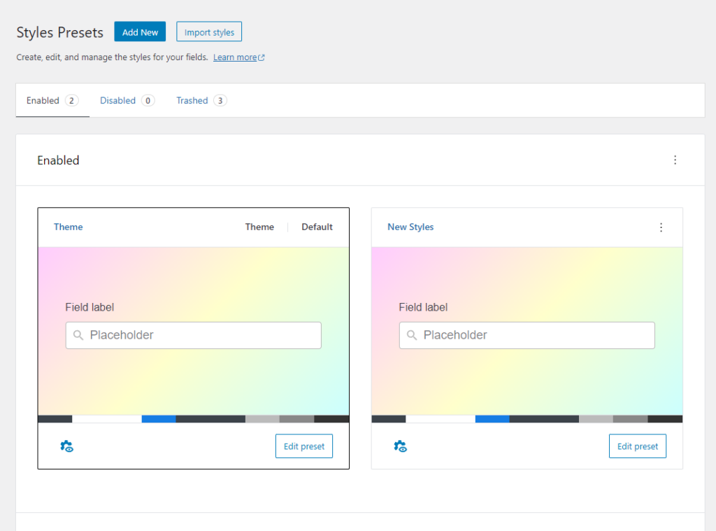
Providing a theme style gives users visually pleasing and sensible defaults when working with your theme and Search & Filter. Users are still able to create their own styles presets if they wish.
There are two ways to add default styling support for Search & Filter:
Via theme.json
The default framework structure of theme JSON looks something like this:
{
	"$schema": "https://schemas.wp.org/trunk/theme.json",
	"version": 2,
	"settings": {},
	"styles": {
		"blocks": {},
		"color": {},
		"elements": {},
		"spacing": {},
		"typography": {}
	}
}
Note: values and theme settings have been removed for simplicity.
To add support for Search & Filter styles presets requires adding a sub property plugins to the styles property, followed by another property with our plugin slug search-filter.
Adding this to the styles section would look like this:
{
	"$schema": "https://schemas.wp.org/trunk/theme.json",
	"version": 2,
	"settings": {},
	"styles": {
		"blocks": {},
		"color": {},
		"elements": {},
		"spacing": {},
		"typography": {},
		"plugins": {
			"search-filter": {
				"color": {
					"text": "#3C434A",
					"background": "#fff",
					"active-text": "#fff",
					"active-background": "#167DE4",
					"label-text": "#3C434A",
					"secondary": "#3C434A",
					"primary-accent": "#BBBBBB",
					"secondary-accent": "#888888",
					"tertiary-accent": "#333333"
				}
			}
		}
	}
}
Via add_theme_supports
We can also use the PHP function add_theme_supports to set the Theme preset style:
$search_filter_styles = array(
	'color' => array(
		'text'              => '#3C434A',
		'background'        => '#ffffff',
		'active-text'       => '#ffffff',
		'active-background' => '#167DE4',
		'label-text'        => '#3C434A',
		'secondary'         => '#3C434A',
		'primary-accent'    => '#BBBBBB',
		'secondary-accent'  => '#888888',
		'tertiary-accent'   => '#333333'
	)
);

add_theme_support( 'search-filter-styles', $search_filter_styles );
Supported styles
Currently Search & Filter supports customising the color scheme as shown in the examples above
Colors
There are currently 6 colors that can be defined which are used across all our UI widgets. It might be a good idea to design the preset via our styles editor and then copy the color references into your theme settings.
| Name | Property |
|---|---|
| Text | text |
| Background | background |
| Active text | active-text |
| Active background | active-background |
| Label text | label-text |
| Secondary | secondary |
| Primary accent | primary-accent |
| Secondary accent | secondary-accent |
| Tertiary accent | tertiary-accent |
Borders
These sections will be added once version 3 is out of beta.
This will include border style and thickness (colors are already supported above).
Spacing
These sections will be added once version 3 is out of beta.
This will include paddings and margin.
Icons
These sections will be added once version 3 is out of beta.
It will be possible to replace any of the icons used in our plugin with icons defined by the theme.